Design your booth to make the right buyer stop within 30 seconds, not to win an aesthetics contest. Start by matching a concept to your footprint and commercial goal, then build outward from there: layout and staffing choreography, graphics and lighting, technology, and a modular-versus-custom budget call. This guide organizes booth design ideas by size and purpose, then hands you a copyable brief so the concept survives contact with a real show floor.
TL;DR:
- A booth should be designed around its specific footprint and goals, focusing on clear sightlines, open entry points, and a compelling headline visible from the aisle.
- Prioritize visibility of proof points, demos, and clear pathways for visitors within the first 30 seconds to maximize engagement and lead qualification.
- Use bold, simple graphics with high-contrast type, targeted lighting, and compelling headlines that answer visitors’ main questions rather than relying solely on branding.
- Incorporate interactive elements facing outward, and pair technology with staff who can explain or facilitate conversions, while considering accessibility and booth regulations.
- Opt for modular rental setups for infrequent shows and custom builds only if attending multiple times annually, with early planning for regulations, safety, and follow-up strategies.
Table of Contents
- Booth Design Ideas by Footprint and Concept
- Design the Visitor Path: Layout, Flow, and Staffing Choreography
- Graphics, Branding, and Lighting That Read From the Aisle
- Technology and Interactivity Ideas That Actually Attract Qualified Visitors
- Modular, Rental, and Budget Strategies: Where to Splurge, Where to Save
- Turning an Inspiration Gallery Into a Buildable Brief
- The Two-Page Booth Design Brief and Move-In Checklist
- Staying Inside the Lines: Regulations and Safety Standards
- Accessibility Features That Accommodate Every Visitor
- Linking Booth Design to Pre- and Post-Event Engagement
- What Client-Side Teams Get Wrong Most Often
- How King Sixteen Builds Booths That Actually Perform
- Sources
- FAQ
Booth Design Ideas by Footprint and Concept
The best booth design ideas start with your square footage, not a mood board. A 10×10 booth has room for one story; a 20×20 island has room for several, and each footprint rewards a different layout logic.
- 10×10 inline booths: build around a single hero plinth, one visible demo, and a headline that reads from six feet away. Skip the second message. You don’t have room for it.
- 10×20 booths: split into two zones, a demo lane facing the aisle and a seating area behind it for real conversations. This is also where built-in storage starts to matter.
- 20×20 booths: support multi-side traffic, so design sightlines for at least two open approaches and add a defined meeting zone for scheduled appointments.
- Islands and peninsulas: this is where custom booth designs earn their cost. Think stage moments, a hospitality suite, and multiple demo stations that let staff run parallel conversations instead of one line.
- Creative layouts across sizes: open gallery walls, product plinths lit like retail displays, interactive touch walls, and sustainable-material showcases all scale up or down depending on the frame you build them into.
Footprint dictates format, but the booth type also determines the right design approach, from portable modular kits at 10×10 to custom architecture at island scale.
Design the Visitor Path: Layout, Flow, and Staffing Choreography
A render is not a booth design until you can narrate a visitor’s first 30 seconds inside it: aisle scan, stop decision, one conversation, then a clean handoff to a staffer who can qualify or close. That sequence, not the CAD file, is what separates trade show displays that convert from ones that just look good in photos.
Run every concept through this checklist before approving it:
- Is there a headline visible from the aisle that gives a stranger a reason to slow down?
- Is there visible proof, a demo, a product, a screen, within their first few steps in?
- Are the entry points open, with no furniture or kiosk blocking the aisle-facing edge?
- Does staff know who greets, who demos, and who handles the handoff to a meeting seat?
Assign roles explicitly. One greeter scans badges and filters intent. One demo specialist runs the same three-minute pitch on loop. One closer takes qualified visitors to the seating zone. During peak traffic windows, rotate the greeter every 45 minutes. That role burns out fastest.
Pro Tip: Walk your own booth as a stranger would, from the aisle, at a slow pace, before the show opens. If you can’t find the headline or the demo in under 10 seconds, neither can a buyer.
Graphics, Branding, and Lighting That Read From the Aisle
Buyer outcome language beats a big logo every time. A headline like “Cut Setup Time in Half” pulls more foot traffic than a logo blown up to fill the back wall, because it answers the only question a passing visitor is actually asking: what’s in it for me?
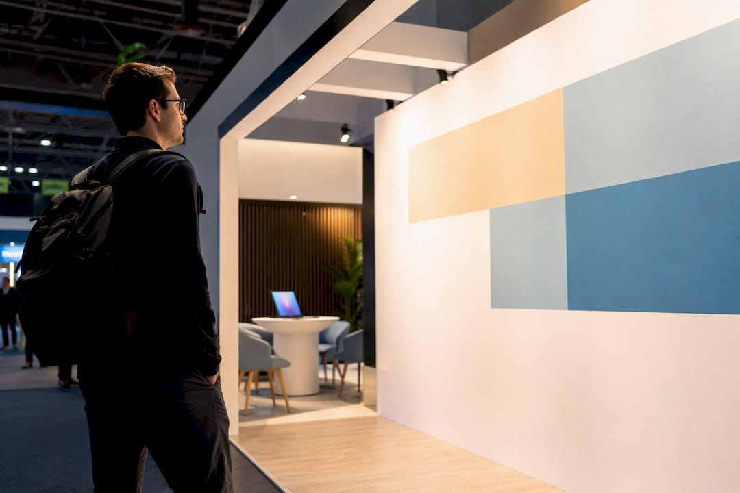
Graphics, lighting, and layout together determine whether a booth converts foot traffic into qualified leads, and strong back wall graphics paired with targeted lighting deliver the best visual return on the money you spend, more than furniture upgrades or printed handouts ever will.
A few rules hold up across formats:
- Keep the top-line headline under seven words. Longer copy doesn’t get read from an aisle.
- Use high-contrast type, light on dark or dark on light, sized to be legible from at least 20 feet.
- Light your hero product or demo station brighter than the surrounding booth. Human eyes go to the brightest point in a scene first.
- Match color temperature to mood: warm light (around 2700 to 3000K) for hospitality zones, cooler light (4000K and up) for tech demos and product plinths.
Booth Element Return on Attention
| Element | Visual Impact | Typical Cost Tier |
|---|---|---|
| Hero demo lighting | High | Low to moderate |
| Back wall graphic | High | Moderate |
| Branded furniture | Low | Moderate to high |
| Printed handouts | Low | Low |
Technology and Interactivity Ideas That Actually Attract Qualified Visitors
Interactive booth features only earn their space when they’re visible from the aisle. A demo loop playing on a screen that faces inward toward your staff table is invisible to the exact people you’re trying to attract. Turn it outward.
- Run a live demo loop on repeat, facing the aisle, with sound off and captions on for noisy show floors.
- Use touch kiosks for quick qualification: three fields max (name, company, and the one need that matters to your sales team) before a badge scan finishes the rest.
- Reserve AR or VR for booths where it genuinely reinforces the headline message. It’s a distraction when it doesn’t.
- Build an offline backstop into every kiosk and badge scanner. Show floor Wi-Fi fails more often than exhibitors plan for, and a staffer with a paper form beats a dead kiosk.
Pair any interactive activation with a staffer nearby who can explain it in one sentence. Tech that requires a manual doesn’t get used.
Modular, Rental, and Budget Strategies: Where to Splurge, Where to Save
Custom fabrication makes sense when you show three or more times a year at the same tier of event and can amortize the build cost. Modular and rental setups make more sense for occasional exhibitors or teams testing a new market, where freight and storage costs would otherwise eat the budget.
Industry benchmarks from CEIR suggest booth space runs roughly 25 to 35 percent of a total exhibiting budget, with the remainder going to design, fabrication, freight, labor, and lead capture tools. That ratio should guide where you spend inside the booth itself.
- Splurge on lighting, your hero demo station, and a lead capture system that actually syncs to your CRM.
- Save on furniture rentals and printed collateral. Attendees rarely keep either.
- Reuse modular walls and graphics panels across shows when you choose booth materials built for repeat setup, not single-use foam board.
- Track true booth cost benchmarks before you sign a fabricator contract. Hidden freight and drayage fees are where budgets usually break.
Turning an Inspiration Gallery Into a Buildable Brief
Photo galleries are where most booth design inspiration starts, and sites built specifically as image banks for booth concepts are genuinely useful for that first pass. The mistake is stopping there. A Pinterest board full of pretty booths tells your fabricator almost nothing about what to actually build.
- Pull 6 to 8 images that share a theme, not 40 random favorites. Volume dilutes focus.
- For each image, note the dimensions implied, the sightlines the photo suggests, the materials visible, and the lighting approach used.
- Extract six concrete requirements from that set: headline placement, hero focal point, material palette, lighting plan, staffing zones, and storage location.
- Confirm usage rights before sharing third-party images in an RFP, and review a vendor’s own build portfolio against the same six requirements before you hire them.
Aligning the visuals to your actual buyer’s role before you finalize graphics keeps a good-looking board from becoming a booth that doesn’t sell.
The Two-Page Booth Design Brief and Move-In Checklist
A tight brief prevents the expensive late changes that show up as rush fees during move-in week. Copy these fields into a project doc or RFP before you brief a designer or fabricator:
- Event context: show name, dates, hall, and booth footprint.
- Audience and commercial goal: who walks the floor, and what you need the booth to produce.
- Primary message and demo needs: the one headline, and what proof supports it.
- Staffing plan, budget ceiling, and hard deadlines for graphics and fabrication approval.
- Venue rules: height limits, rigging restrictions, and any labor union requirements at that hall.
At move-in, run a short checklist: proof graphics against the final approved files, test every light fixture, run the demo loop start to finish, test badge capture end to end, and confirm you can physically reach your storage space once walls are up. Before signing a vendor, ask directly who owns the art files, how damage claims are handled, and what the freight and install limits are. Those questions, not the render, are what actually protect your budget.
Staying Inside the Lines: Regulations and Safety Standards
Every show issues an exhibitor manual, and it’s the single most-skipped document in the entire booth design process. That manual sets your height limits, rigging rules, fire marshal requirements, and ADA compliance standards for your specific hall, and those rules vary by venue and by show organizer.
Height restrictions are the most common surprise. Many convention centers cap standard inline booths at 8 feet and island exhibits at higher limits, but the exact number depends on the hall and your neighboring exhibitors’ sightlines. Confirm the cap before your fabricator builds a single wall panel.
Fire marshal rules govern flame-retardant certification for drapes, carpet, and any fabric used in your build. Most venues require a certificate of flame resistance on file before move-in, and inspectors do walk the floor checking. Electrical work above a certain amperage typically has to go through a venue’s in-house electrician rather than your own crew, which affects both your timeline and your budget.
ADA compliance touches your booth in specific, checkable ways: aisle clearance for wheelchairs, counter heights low enough for a seated visitor to sign in or interact with a kiosk, and ramp access to any raised platform or stage element. This isn’t a suggestion layered on top of your design. It’s a legal requirement in most US venues, and violations can mean a forced teardown during the show itself.
Build a compliance line item into your brief with the same weight as your budget line. A stunning concept that gets flagged by a fire marshal on move-in day is not a stunning concept. It’s a delay.
Accessibility Features That Accommodate Every Visitor
Accessible booth design is good design, full stop, not a separate checklist bolted onto the “real” plan. Start with physical clearance: aisles wide enough for a wheelchair to turn, and no cabling or floor graphics that create a tripping hazard for a visitor using a cane or a mobility device.
Counter and kiosk heights matter more than most first-time exhibitors realize. A touch kiosk mounted at standing-adult height is unusable for a seated visitor, so build in at least one interaction point at a lower, seated-accessible height. The same logic applies to your demo station. If your hero product sits on a high plinth, make sure a lower vantage point exists for visitors who can’t see over it.
Sensory considerations count too. If your booth runs a loud demo loop or flashing lighting effects, offer a quieter zone nearby for visitors sensitive to noise or strobing light. Captions on video content help far more visitors than just those with hearing loss. Anyone standing in a noisy hall benefits from being able to read what a demo says instead of straining to hear it over the aisle noise.
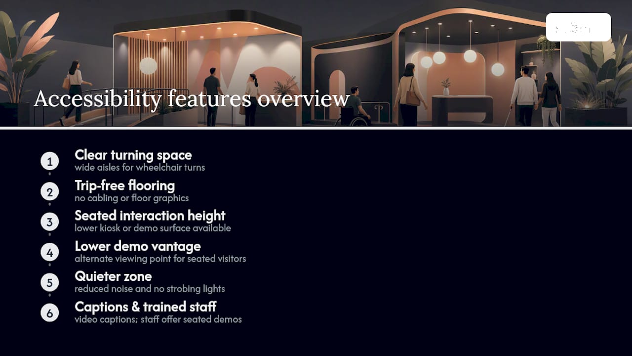
Train your staff on this the same way you train them on your pitch. A greeter who knows to offer a seated demo option, without being asked, does more for accessibility than any physical feature you build into the booth itself.
Linking Booth Design to Pre- and Post-Event Engagement
The booth itself is the middle of a longer arc, not the whole story. Pre-show promotion should tease the specific thing a visitor will see at your booth, not a generic “visit us at booth 412.” If your hero demo is a live product comparison, say so in your pre-show email and social posts. That specificity is what turns a booth number into a destination on someone’s floor-walking list.
Design your badge capture flow to feed directly into that pre-show promise. If you told a prospect on LinkedIn they’d see a specific demo, your kiosk or greeter script should reference it by name when they arrive. That continuity is what makes a booth visit feel planned rather than accidental, on both sides.
Post-event follow-up depends entirely on what you captured at the booth, which is why the qualification fields on your kiosk or badge scan matter more than they seem to in the planning phase. A generic “scanned badge” gives your sales team nothing to work with three days later. A qualification field tied to the specific demo a visitor watched gives them an opening line.
Build the follow-up sequence before the show, not after. Decide which conversations trigger a same-week call, which get a nurture email, and which get a simple thank-you. The booth design that generates the best leads is worthless if the follow-up process can’t act on what it collected within days, not weeks.
What Client-Side Teams Get Wrong Most Often
The two failures I see repeated most often on show floors are a staffing plan built for a slow morning and a booth wall that blocks the exact sightline the design brief promised. Both are fixable before move-in, not during it. Turnkey coordination across design, fabrication, and staffing tends to catch these gaps earlier, because one team is accountable for the whole sequence instead of three vendors each owning a piece. On one activation, simply moving a kiosk six feet to open a blocked entry point measurably increased stop rate during peak hours.
— Tyler
How King Sixteen Builds Booths That Actually Perform
King Sixteen is the alternative to juggling separate vendors for design, fabrication, staffing, and AV. One team owns the whole build from concept through move-in, so a blocked sightline or a staffing gap gets caught before the show floor, not during it.
If your show calendar is light, a modular rental system and the checklist above will likely carry you through. If you’re running an island footprint, launching a product, or need a hospitality suite alongside a multi-demo layout, that’s where a dedicated production partner earns its cost. King Sixteen handles custom builds and fabrication, staffing, and AV as one coordinated project instead of five separate contracts.
Start with a discovery call or send over your show dates and footprint for a scoped proposal through the King Sixteen team. If you already have a concept sketched out, that conversation is the fastest way to find out what it will actually take to build it.
Sources
The ExhibitionsVoice booth design guide covers visitor-path planning and budget ratios. VistaPrint’s booth design resource breaks down graphics and lighting priorities. Booth Design Ideas offers a large image gallery for early-stage inspiration. Baby Love Growth’s visual storytelling guide covers audience-aligned messaging.
- Trade Show Booth Design Guide 2026 | ExhibitionsVoice Blog
- Trade Show Booth Design Ideas | VistaPrint US
- Booth Design Ideas - Trade Show Booth Design Ideas & Inspiration Gallery
- Visual storytelling tips: boost your brand’s impact
FAQ
What Size Booth Is Best for a First-Time Exhibitor?
A 10×10 inline booth is the standard starting point. It forces a single clear message and demo, which is often harder to execute in a larger footprint anyway.
How Much of My Budget Should Go to Booth Space Versus Design?
Booth space typically runs 25 to 35 percent of a total exhibiting budget, with the rest covering design, fabrication, freight, labor, and lead capture tools.
Should I Rent a Modular Booth or Build Custom?
Rent modular if you exhibit occasionally or are testing a new show; build custom if you attend three or more shows a year at the same tier and can amortize the cost across them.
What’s the Fastest Way to Improve an Existing Booth Design?
Walk it as a stranger would from the aisle and time how long it takes to spot your headline and demo. If it’s over 10 seconds, fix the sightline before anything else.
Does King Sixteen Handle Full Booth Fabrication and Staffing?
Yes. King Sixteen runs turnkey trade show production, including design, custom fabrication, staffing, and AV, through one coordinated project rather than separate vendor contracts.
Recommended
- Event Planners: Trade Show Booth Materials to Buy, Rent, and Reuse
- Avoid Hidden Fees: 2026 Trade Show Booth Cost Benchmarks, Agency Fixes
- Custom Marketing Display Builds That Drive Real Impact
- Custom POP Displays: A Brand Manager’s Design Guide