An effective registration area separates pre-registered guests from walk-ups, marks each lane with signage readable from 30 feet, sets tables perpendicular to traffic flow, and staffs an exceptions desk for anything a QR code can’t fix. Get that configuration right and you cut average wait times dramatically, calm the entrance, and set the tone for everything that follows. Trade Show Streets frames it as a flow problem, not a furniture problem, and that distinction changes how you plan the whole space.
TL;DR:
- Proper placement of the registration desk at least 30 to 40 feet inside the entrance prevents lines from spilling into the street and allows guests to settle before queuing.
- Signage should be large, clear, and positioned before decision points to help guests self-sort and reduce staff questions during check-in.
- A hybrid check-in system using self-serve kiosks for pre-registered attendees and staffed lanes for walk-ups optimizes throughput and flexibility.
- The most effective registration design includes five zones: pre-registered, onsite, VIP, reprint/exceptions, and help desk, all supporting a smooth flow.
- Staffing should match peak arrival estimates, with a dedicated line manager using wireless headsets to coordinate staff and update signage in real time.
Table of Contents
- What Belongs in a Well-Designed Registration Area?
- Where Exactly Should the Registration Desk Go?
- What Signs Do You Actually Need at Check-In?
- How Many Staff Do You Need at Peak Arrival?
- Kiosks or Staffed Lanes: Which Handles Check-In Better?
- What Makes a Badge Actually Readable?
- Is Your Registration Area Actually Accessible?
- What Can Go Wrong on Event Day, and How Do You Fix It Fast?
- How Do Branded Events Change Registration Planning?
- Why Registration Is the Real First Impression
- Ready to Design a Registration Area That Reflects Your Brand?
- Sources
- FAQ
What Belongs in a Well-Designed Registration Area?
Before you order a single table, map the flow: arrival, verify, badge, welcome, send-off. Every design choice, from where you put stanchions to how many kiosks you rent, should serve that sequence without introducing a detour. This flow-first approach is the backbone of good check-in design, and skipping it is how planners end up with a beautiful desk that still backs up into the parking lot.
At minimum, your registration area design needs five zones:
- Pre-registered lane for QR/badge scan, fastest throughput
- Onsite/walk-up lane for new registrations and payment
- VIP or speaker lane with dedicated staff and shorter wait
- Reprint/exceptions desk for lost badges, name errors, missing entries
- Help desk for general questions, separate from the transaction lanes
Brand presence matters here, but keep it light. A branded backdrop behind the desk and consistent signage colors do more for recognition than scattering logos across every surface, which just adds visual noise to an area that needs to move fast.
Where Exactly Should the Registration Desk Go?
Placement beats staffing almost every time. A poorly located desk creates a bottleneck no amount of extra staff can fix, according to Corporate Events, which recommends setting the desk 30 to 40 feet inside the entrance whenever the venue allows it. That buffer gives arriving guests room to shed coats, check phones, and queue without the line spilling into the street or lobby.
- Measure venue depth first. If your entrance hall is shorter than 30 feet, angle the queue rather than pushing the desk against the door.
- Use perpendicular tables, not a straight parallel line facing the door. Perpendicular geometry lets multiple stations work independently and shortens the walk from queue to badge pickup.
- Stage a second table behind the main desk for badge stock, lanyards, and reprint supplies, so staff never turn their back on the line to dig through boxes.
- Plan stanchion lanes with a buffer zone for overflow. If your projected peak exceeds your lane capacity, add a folding switchback rather than letting the line snake into a fire lane.
- Split alphabetically based on actual surname data, not a blind A to M/N to Z guess. Attendee lists from past years often skew heavily toward certain letter ranges, and an even split by volume beats an even split by alphabet.
What Signs Do You Actually Need at Check-In?
Signage does the job that extra staff can’t: it answers questions before anyone has to ask. CrowdComms notes that signage needs to be visible from a distance and placed before a decision point, not after someone’s already stuck in the wrong line.
- Make category signs big enough to read from 30 feet: Pre-Registered, Onsite, VIP, Help Desk.
- Hang signs where the queue splits, not at the desk itself, so people self-sort before they commit to a lane.
- Match your signage wording to your pre-event emails and confirmation texts. If the email said “Fast Lane,” don’t call it “Express” onsite.
- Use short, action-driven micro-copy: “Have your QR ready,” “You’re done. Go this way,” “Lost your badge? Ask here.”
Consistency across every touchpoint, email, app, and physical sign, is what actually reduces confusion, more than any single sign’s design.
How Many Staff Do You Need at Peak Arrival?
Staff to the arrival curve, not the full-day average. Corporate Events recommends keeping full staffing through the first 75% of your expected arrival window, then scaling down once the rush passes. A flat staffing model wastes labor budget in the slow hours and still leaves you short during the first 20 minutes, which is exactly when first impressions form.
- Estimate your processing rate per lane (roughly 30 to 45 seconds per pre-registered scan, longer for onsite registration).
- Divide expected peak arrivals by that rate to determine lane count, then add one buffer lane for the unexpected surge.
- Assign roles clearly: lane staff scan and hand off, a floater roams to redirect and answer questions, an exceptions desk handles anything off-script, and a line manager watches the whole queue for backups.
- Brief the team 30 to 60 minutes before doors open, covering the not-on-list protocol, VIP handling, and who to call if a printer jams.
Pro Tip: Give your line manager a wireless headset connected to the floaters, not just a walkie. Shouting across a lobby full of guests undercuts the polished first impression you just spent weeks designing.
Kiosks or Staffed Lanes: Which Handles Check-In Better?
Neither, alone, is the right answer. A hybrid model, self-serve kiosks for pre-registered QR users paired with staffed lanes for walk-ups and edge cases, balances speed with the flexibility humans provide. WebMobi suggests roughly one kiosk per 75 expected peak day-one attendees, plus a few dedicated walk-up kiosks to absorb overflow.
- Reserve self-serve kiosks strictly for pre-registered attendees with a working QR code.
- Route anyone without a scannable code, or anyone registering a group, straight to a staffed lane.
- Separate the check-in station from badge pickup when you print on demand, so a printer jam doesn’t stall the whole line.
- Keep a spare printer and a paper backup list on hand. Networks fail; paper doesn’t.
If your event runs on QR-based guestflow, King Sixteen’s agency playbook for QR check-in walks through the exact hardware and vendor coordination that makes this hybrid model hold up at scale.
What Makes a Badge Actually Readable?
A badge that nobody can read at a glance defeats the entire point of scannable check-in. Print the attendee’s first name large, company name secondary but clear, and use a bold color block to signal access level (attendee, speaker, sponsor, staff) at a glance. The scannable code needs to be legible from 6 to 8 feet, not just under a scanner’s nose, so sponsors and session staff can identify who’s who without stopping anyone.
- Stage lanyards and sponsored collateral on a second surface behind the desk, never on the main check-in table.
- Place maps and schedules after the lane, not inside it, so people don’t stop mid-queue to read.
- Anything that invites someone to pause, a prize wheel, a photo booth, a sample table, belongs 15 feet past the last badge scan.
- For high-volume events, King Sixteen’s guide to deploying RFID badges covers lead times worth knowing before you lock your badge vendor.
Is Your Registration Area Actually Accessible?
An ADA-compliant lower counter and a marked priority lane aren’t optional extras. They’re baseline requirements for a registration area design that works for everyone. Route the standard queue around any accessible path, never across it, and anchor stanchions so a bumped line doesn’t become a hazard.
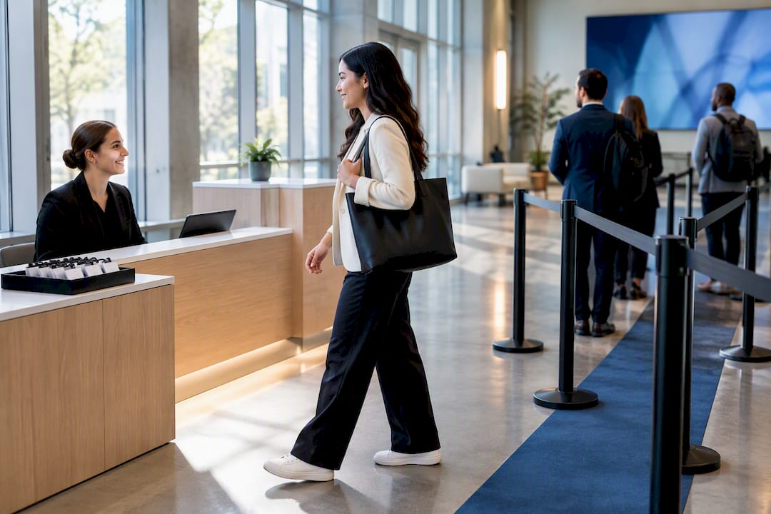
Keep at least one quiet, low-traffic spot near registration for anyone who needs a moment away from noise or crowds, and mark it with simple, high-visibility signage. Confirm your emergency egress paths stay clear even at your busiest projected arrival minute, not just on the empty floor plan.
What Can Go Wrong on Event Day, and How Do You Fix It Fast?
Test everything the day before: kiosks, printers, wifi, badge scanners. Assume something will still fail anyway.
- Print a paper backup list and stage spare badge stock, even if you’re printing on demand.
- Brief staff on a firm schedule, with the exceptions protocol repeated out loud, not just handed out on paper.
- Assign a floater to estimate live wait times and update signage in real time if a lane backs up.
- Set a trigger point, a specific wait time or queue length, for when to open an overflow lane rather than waiting until the line is already out the door.
Printer jams and network drops cause most day-of failures. A spare printer and a paper fallback solve both in under two minutes.
How Do Branded Events Change Registration Planning?
Standard check-in best practices assume a folding table and a laptop. A product launch or flagship conference assumes something closer to a designed environment: branded kiosks, sightlines that frame a welcome moment, and AV cues that build anticipation before a guest even reaches the desk. Those elements change every decision, from where you place a step-and-repeat to how a badge color signals VIP access to a photographer.
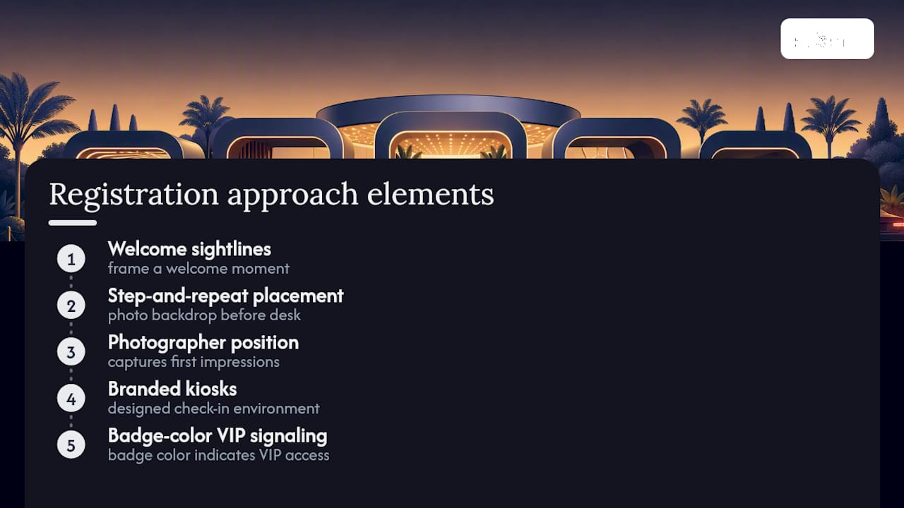
Handling design, fabrication, staffing, and logistics through one accountable partner removes the coordination gap that shows up when five vendors each own a different piece. When you brief an agency, give them three things: the emotion you want attendees to feel in the first 60 seconds, your throughput KPI (average wait time, badges per minute), and any brand must-haves that can’t be compromised for speed. King Sixteen’s attendee experience guide covers how that handoff from registration into the broader event experience should feel.
Why Registration Is the Real First Impression
Registration is the first five minutes of your event, and it sets the emotional tone for everything after it. A calm, well-marked check-in tells guests the whole day will run smoothly. A chaotic one puts sponsors, speakers, and staff on edge before the doors even open fully.
Good registration area design also protects your team. Clear zones and staffing curves reduce the decisions staff have to make on the fly, which means fewer mistakes and less burnout by hour three. Bring in a turnkey partner when the stakes include brand impact, not just throughput.
— Tyler
Ready to Design a Registration Area That Reflects Your Brand?
A folding table and a laptop can check people in. They can’t make a launch feel like an event people talk about for months. An advantage is single-accountability: one partner handling design, fabrication, staffing, AV, and logistics for your registration area and everything around it, instead of you coordinating multiple separate vendors under deadline pressure.
This turnkey model fits best for brands running high-value product launches, multi-day conferences, or activations where the check-in moment needs to match the polish of the main stage. Agencies like this have handled that exact challenge for major brands, building registration experiences that work as hard as the rest of the event. If your next launch or conference needs registration design that performs and looks the part, start with King Sixteen’s experiential services page or review the full range of production capabilities at Kingsixteen to request a quote.
Sources
- How to Design a Seamless Expo Check-In Experience - Trade Show Streets
- Registration desk placement that prevents the entrance jam
- Onsite registration kiosks: getting check-in right | WebMobi
FAQ
What Is an Example of a Well-Designed Registration Setup?
A strong example separates pre-registered QR check-in from walk-up registration, uses perpendicular tables to speed transactions, and places a staffed exceptions desk nearby for anything that doesn’t scan cleanly. Conferences using this layout with kiosks sized to peak attendance tend to clear their morning rush without the entrance line backing up outside.
What Is the Best Platform for Event Registration?
There’s no single best platform. It depends on your event size, budget, and whether you need onsite payment processing, and King Sixteen selects registration technology based on each event’s specific throughput and branding needs rather than defaulting to one vendor. Planners running events with a hybrid check-in should prioritize a platform that supports QR-based self-serve alongside staffed lanes, as outlined in the kiosk guidance above.
Does Microsoft Have an Event Registration Tool?
Microsoft offers event and registration features through Microsoft Bookings and integrations within Microsoft productivity tools, though these are generally built for smaller internal or business meetings rather than large conference check-in. For high-volume events, most planners pair a dedicated registration platform with onsite kiosks and staffed lanes instead.
How Do I Create an Event Registration Form?
Build your registration form around the fields your onsite check-in actually needs: full name, company, badge category, and dietary or accessibility notes if relevant. Keep the form short. Every extra field slows down data entry and increases the chance of an error that shows up as a line delay at your registration desk.
Recommended
- Advantages of Turnkey Event Services for Planners
- Crowd Flow Management for Brand Activations That Convert
- Wayfinding Signage Design That Guides Attendees, Not Just Decorates